August 2017 - THIS week's PICTURE
Smithsonian Cubist Gallery, DC: 4 takes, #3 photo by Malcolm Aslett
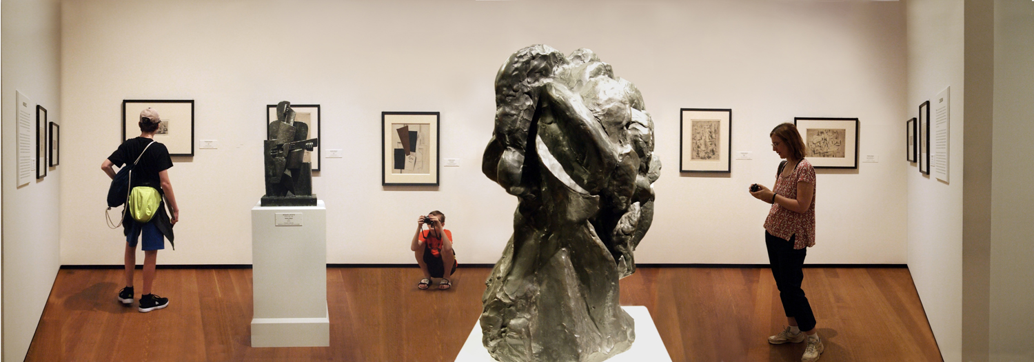 |
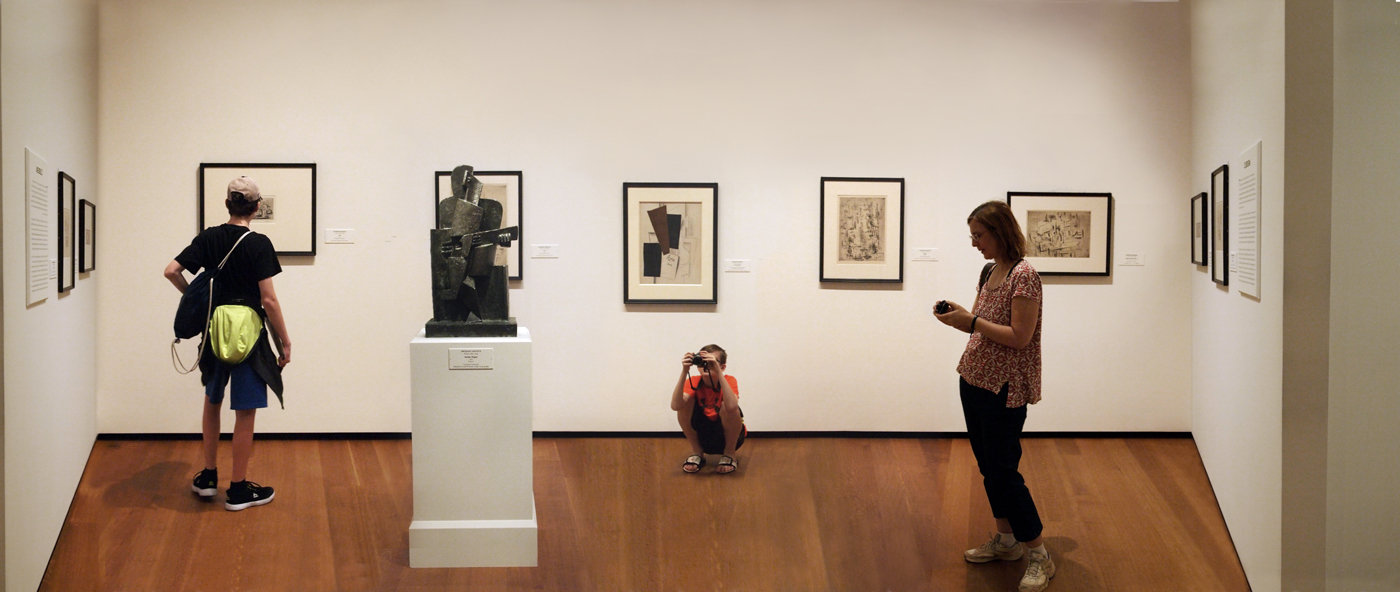
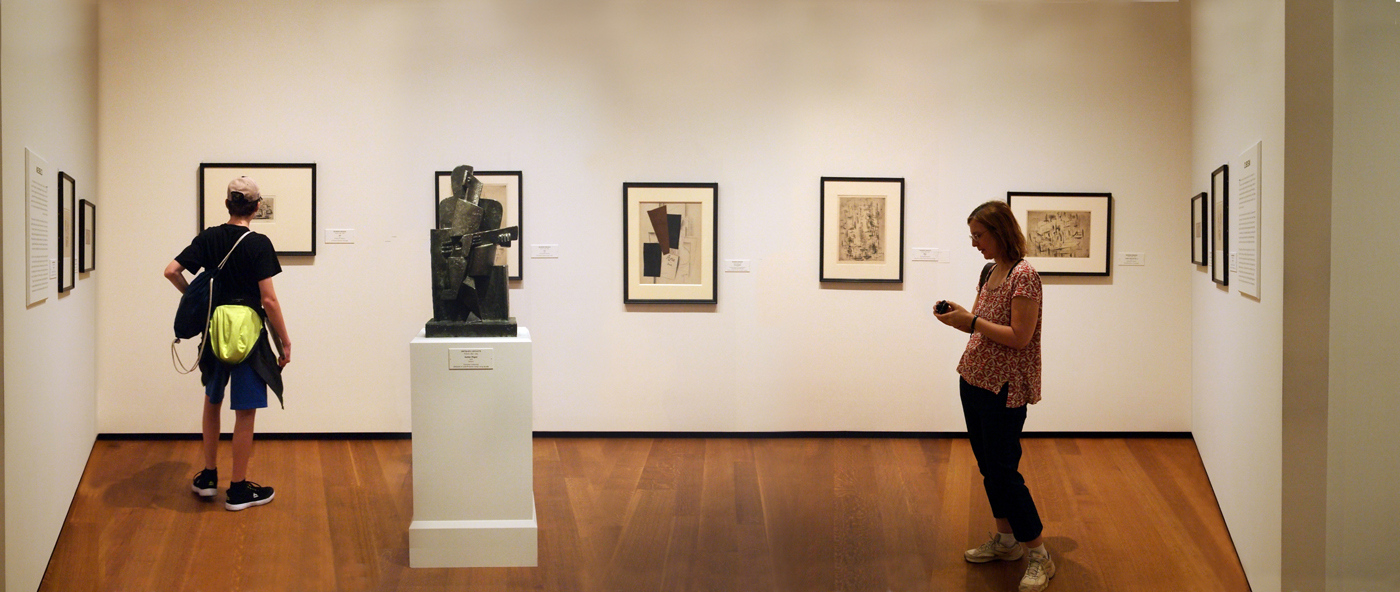
The difference between this one and the previous two versions is the insertion of the Picasso sculpture of Fernande Oliver. Unfortunately, this is a bad angle to see the work in and makes her look like the Elephant Man. It complicates the whole issue and while it gives us more to look at and think about it is also a further indicator of what we look for in a photograph, which is to say, usually less. What we perceive to be great photographs and successfull paintings tend to be monolithic things in that they are 'short and to the point'. People like simplicity and order, in their politics and in the artistic instincts. How many great paintings conform to the golden section or have that pyramidal composition at the center? Or the corner to corner diagonals dictating major forms? And what is greater to most people's minds, the simple observation of a goldfinch by Fabritius or a necessarily busy battle painting by Meissonier? (I chose Meissonier as an example because he was hugely successful in his day but little known now). We don't normally want a twenty four course meal for our art experience. We prefer bite sized snacks. Short, sweet, simple. The head might be giving more information about the place and the exhibitis, reinforcing the cubist origins of ideas, but it clutters the place as well. What is the world coming to when a Picasso sculpture is just clutter to us? This is my interpretation. I'll put the previous versions below for you to decide yourself.
|
|
|