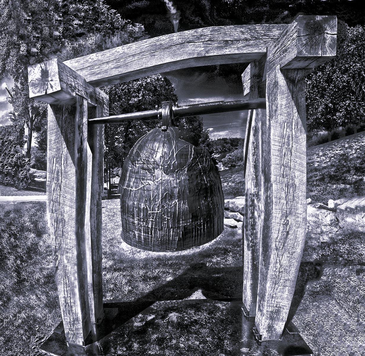
TWO BELLS : photo by Malcolm Aslett
|
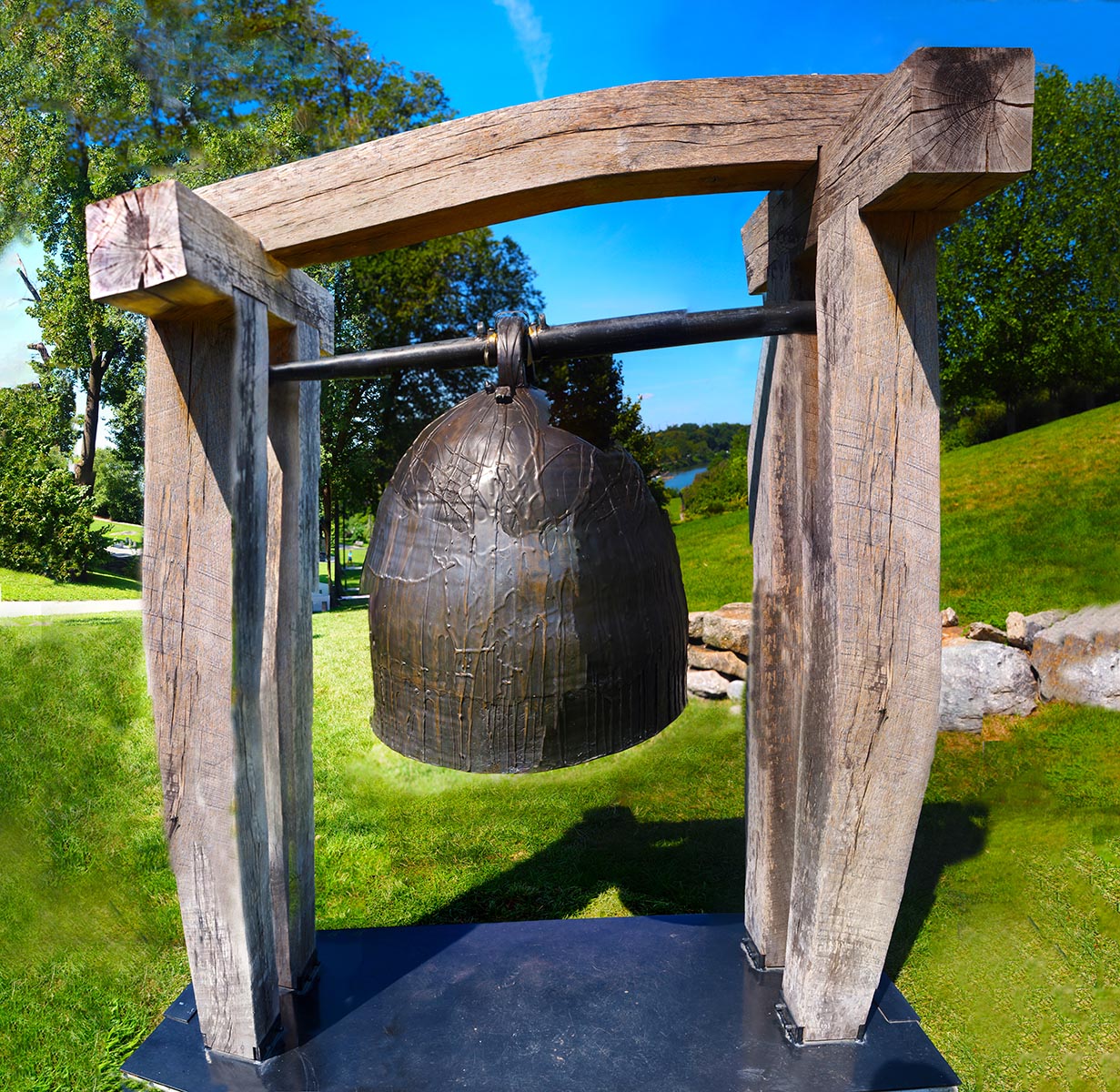
Size is again an issue. I did a large version of this in colour - as seen in a small version below. I had hoped for more, in the sense I didn't think this version was telling me much of what was new about this object.. It's a bell hung between large wooden beams.An attractive object in itself. When the parts were put together all that distinguished it was the skewing of the forms. I had not added anything special to the scene. That's what I thought. If you were able to study the large format image you would see more interesting things in the details, like odd transitions of sharpness and blurring between items that shouldn't have had that problem (like the foliage to top left). One of the pains of modern digital images is that flatness of purpose that can occur when all edges are sharp and all colours vivid. That can grow tiring as it seems to be relenquishing choices to the technology. If the choice is mechanical maybe it isn't a choice at all. (Granted, when we see an image with a sharp foreground and blurred background you could argue the same thing. That argument needs extending a little). Now it's black and white it reminds me of Hitchcock. The film Rebecca and the cliffs of England with a bit of melodrama. Not sure if that helps. The main image here was passed through some contrast filters to make it dark and bring out the drawing quality of beams and foliage. Certain sloppy areas of joining were left as they were. You can see this in the glowing light areas directly under the bell. I don't know if the average person would put that together or think there was a natural reason for it. When you know, it is obvious. For me, I prefer retaining the imperfections in this one, like a drawing with unclarified contours in parts. If there is not a definitive photo to have then I think it alright to have the indefinite retained in them. |
|
|