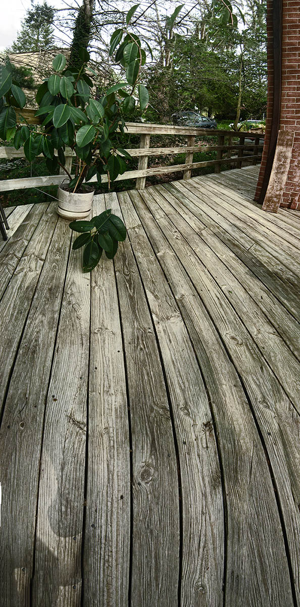
Deck Lines : photo by Malcolm Aslett
|
This is straightforward. A picture of the wood on a deck plus a bit of the house and fencing and a plant. When I do this kind of thing I think of the composition of graphics and paintings in the late nineteenth century, when, with the influence of Japanese prints, there could be an expanse of the picture with essentially not much, but balanaced with a subject at the other side. The design in those cases was usually with a rectangle that was wider than it was long. Does the same aesthetic work this way? I think it doesn't work as well, for some reason. The spectator becomes more aware of the expanse at the front because this is perceived as the foreground - which it is. The 'subject' at the front might seem a bit bland and we look to the back to make some sense of what we are seeing, to give the picture a point. That point in this context is mostly to identify the location. I love looking at wood grain. It is a subject in itself. And this one has the oddities of not behaving in proper perspective. It may not be enough for some. The radical perspective of the fence also sets up a bit of drama at top. But is all of this enough to suggest to the viewer that the picture is complete and has a unified purpose? It's that final optical bulge close to the bottom that either defeats or makes the picture. If the lines had continued straight I think the image as a working composition would have been less problematic to an unconscious aesthetic. Why abstract forms and shapes should be pleasing or not to the viewer is one of the first tasks psychologists set themselves with the questions of why art pleases. Not sure if they came up with any right answers. Damn sure I don't have any solid answers to it. |
|
|