October 2017 - THIS week's PICTURE
Interior of the Jefferson Room, Farmington, Charlottesville (unfinished) : photo by Malcolm Aslett
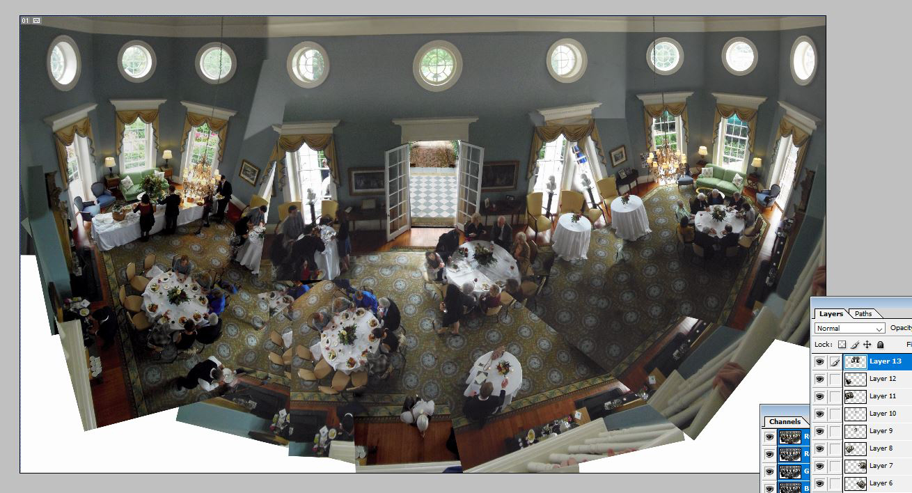 |
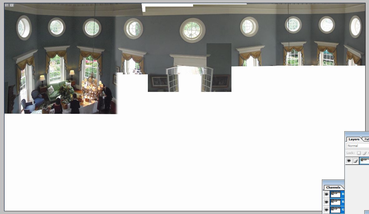
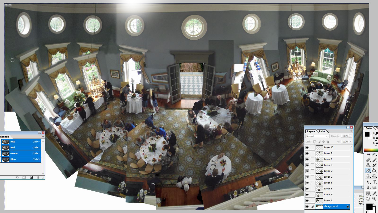
Farmington is a mini-Monticello, only bigger. The main parts of the 'house' were designed by Thomas Jefferson. (Don't you just love it when a book says "built by Julius Caeser" or the like, when we really know they never laid a brick of painted a wall in their life?). Farmington is now one of those rather peculiar American things: a country club. I'll stop there on the subject before I say things that distract from the matter in hand. The main room is a terrific space, lozenge shaped, two rooms high so it can be lit by nine circular windows above eight sash windows and a pair of French doors. To give it coherence I had one of two choices as I saw it: unite the floor space into a rectangle or have the upper windows on the same horizontal. I chose the second and flattened the result into one layer - the photo immediately below shows the screen grab. You might notice the main photo indicates 13 layers but there are perhaps around 20 photos used at this stage. Exposure around the room varies greatly, of course. The central doors are awkward in this respect. To keep the walls consistent in tone and use the best exterior exposure require a few experimental setups. The floor level is the next major hurdle to overcome. My plan is to repeat some of the tables and fill in the spaces with the floor pattern to a point it just about kids the eye it is one plane as long as you don't inspect it with a fine tooth comb. The sash window level that will unite the two more dominant parts I see as less of a problem. The human eye can be pretty lazy in these situations. Like an out of shape prison guard it is only interested in a cursory glance at a couple of troublemakers before signing off on the 'all present and correct' form. The bottom image shows the stage before, when the door had not been 'fixed' to any level (it still needs finessing up close). Notice the irritating state of the left side windows before I repeated an image to extend the table and floor. Now comes the clean up. Naturally, now I've gotten this far, I wonder if I should have done the floor as a rectangle seperately and then faffed around with the middle part to make them match. I know from experience that both have their problems and ultimately it is what looks best. If the result of this version bothers me I might try that.
|
| 00
|
|