Philadelphia buildings 1, 2 & 3 : photo by Malcolm Aslett
|
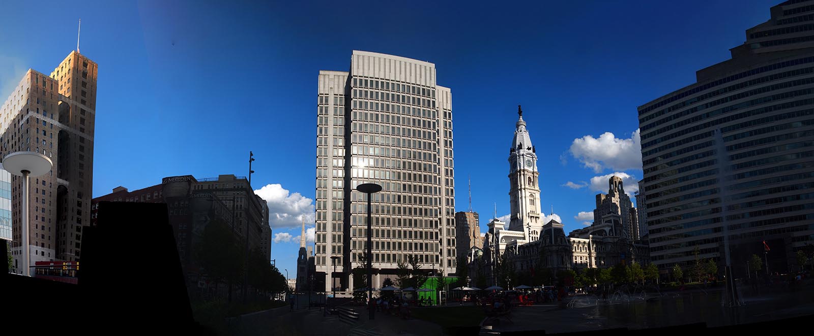
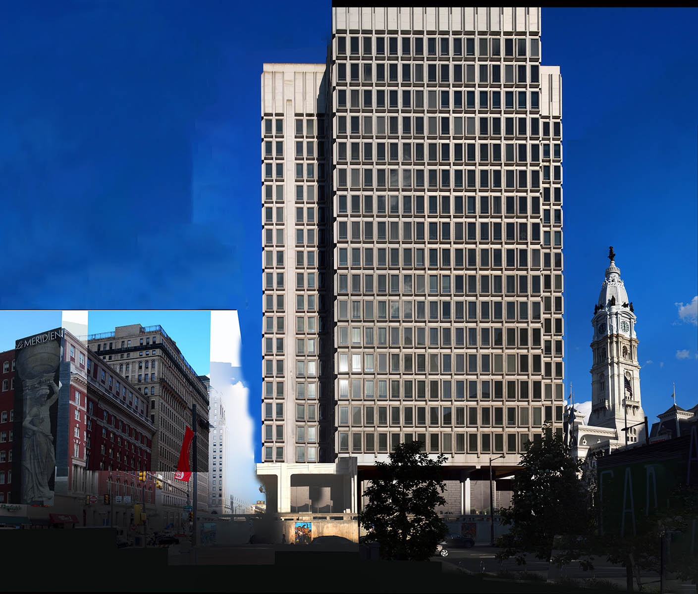
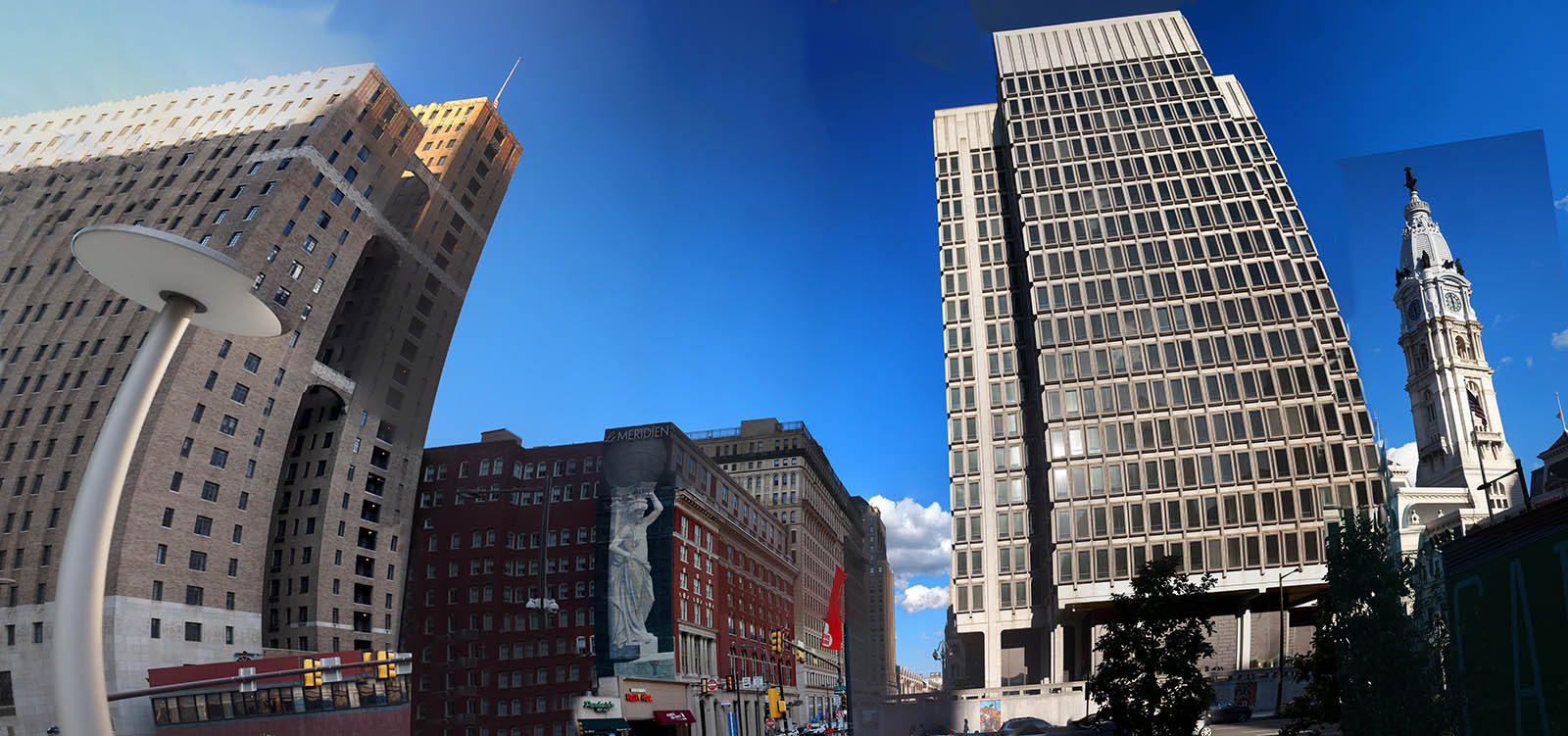
I love the buildings in Philadelpnia. With the modern tall constructions in the city's downtown area and the colonial buildings preserved in the old town area it is a stunning place to photograph and try to make sense of. For the photographer what are your choices? A single building? A skyline? From above or below? The rendering of constructions in space to a particular design is a pictorial exercise with an immense number of outcomes. Here are three takes on a scene at the center of the city, with City Hall peculiarly overshadowed by what I assume is a municipal building in the "we-need-office-space-and-we-need-it-fast" style of architecture. I'm not knocking the design so much as remarking on the practical decision to build in a location that might be sensible in terms of distance but is a disaster in terms of visual unity. That said, it works pretty well for me, as the disparity is a pictorial subject in itself. The photos making the one above were taken late in the day and already putting things in the shade. I've kept the 'verticality' in this one. The joiner below takes the central section photos and keeps the newer building in a more severe frontal shape and includes the dwarfed City Hall spire as well as the striking wall painting on the side of Le Meridien hotel. The third image was largely made using the automatic stitcher and shows the inevitable barrel shapes of the program when covering a wide distance. At least the City Hall retains some of its size in relative terms. The curving of the City Hall tower irritated me here and I replaced it with a straightened one as you can see by the unhidden shape of the rectangle jutting into the sky. The center image is the more 'joinery' of the three. After squaring the facade of the tower block my only interests were the CIty Hall tower and the Meridien wall painting and the defining top corner of the building next to it. I simply added the individual images as a reminder of the details at those points and accepted the different sky values, even emphasizing them by the trail of whited-out pale sky at the bottom edge of the high rise. I like the bleed of blue and white between the hotel and the high rise. The insert also works like an insert. It brings to mind those illustrations of medical procedures with some gruesome detail clipped in. Not necessarily what I was going for but that's what it brings to mind. Each of the final photos is a reminder of different things. The first unifies the skyline in a manner that, despite the distortions, appears to pleasantly record the buildings like a series of actors standing shoulder to shoulder. The second (might) remind you of the hard differences in form that are mostly ignored in our three dimensional experience of the area. The third incorporates the accidental technical compromises necessary for forms to fit, revealing in exaggerated fashion the odd relationships of forms in space from a single viewpoint. None of these actually represent the buildings truthfullly as various additions and subtractions have been made to these living lego pieces. I have lots more of the city buildings and will present some this month. Love doing the skyscrapers. And why doesn't anybody say 'skyscrapers' anymore? |
|
 |