The Philadelphia Museum of Art Galleries, 1, 2, 3, 4 & 5 : photos by Malcolm Aslett
|
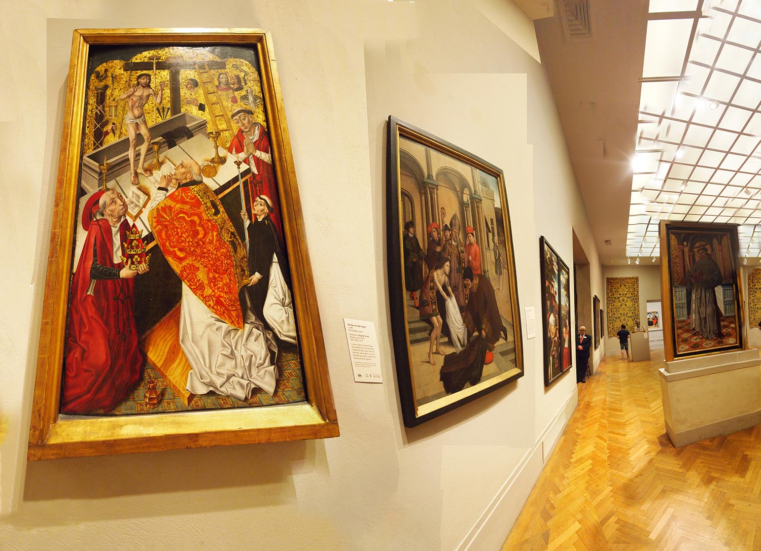
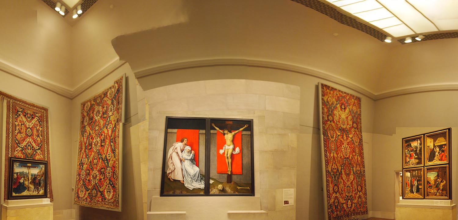
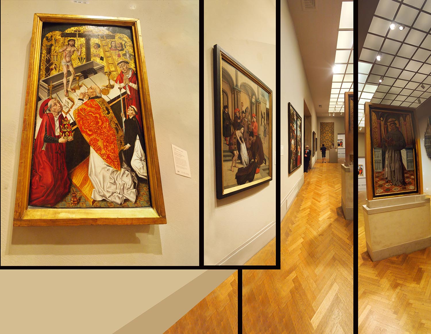
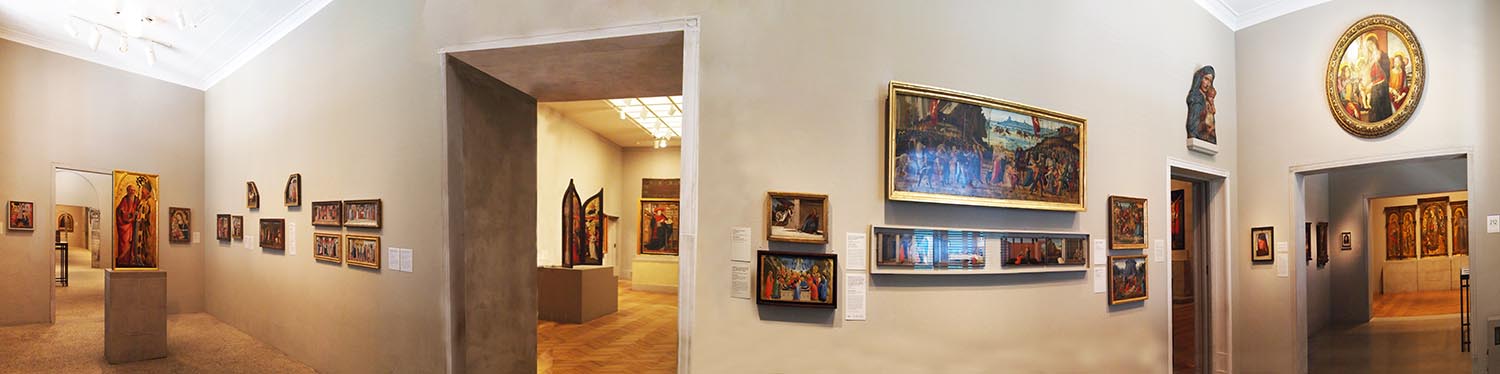
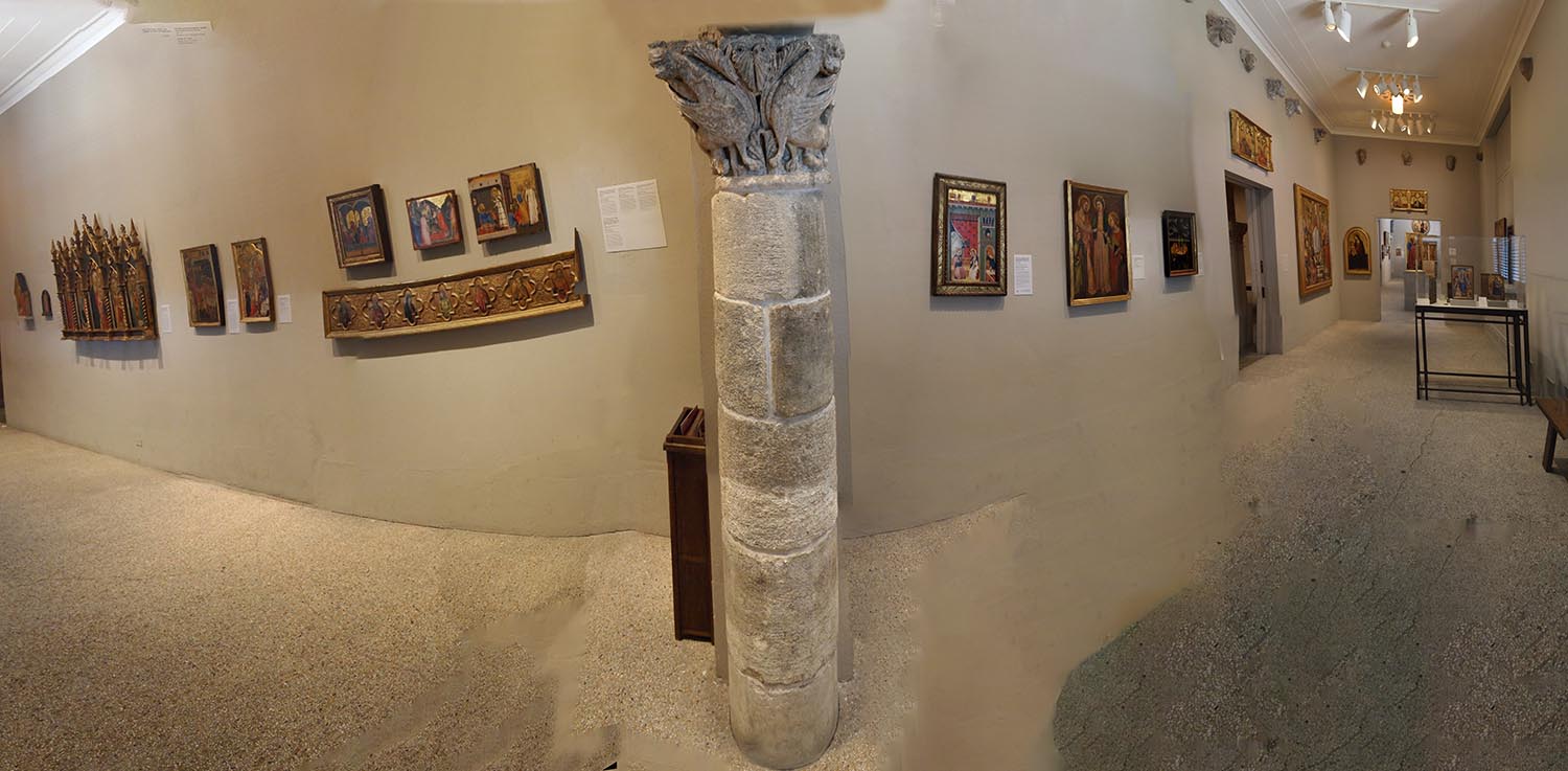
Last week it was the exterior of The Philadelphia Museum of Art and this week it is a view of some of the rooms. I see it as a sub genre of photography, depicting rooms in art galleries. How to present a presentation of Art? There are lots of examples in the pages of Joiner Photography so I do try and do something different once in a while. The one above begins with several collected images of a single painting directly ahead of me. The subsequent photos are taken to the right and have to deal with the wall of neighbouring paintings, the glass roof and the free standing work. I thought I would retain the perspective of the first view as we often unconsciously ignore the slightly uncomfortable positioning of paintings that we are expected to see as a whole and not get to peep into the high corners or even study the frame it is in. Paintings have neighbours and they make up the mood of the room. The pale bare walls here remind you how out of place these religious images are compared to their original spaces. Our antiseptic environment for Art. Overall, I kind of hope that one looks at this photo, studies the version of the main painting, and then tries to figure out the stuff to the right. The one below is the same photo but with black dividers between four elements. It changes our experience, and the compartmentilizing is perhaps an indication of the way I assess a scene. These early Renaissance works from the Low Countries have a very special feel and also stand at the birth of modern optics so I consider them closer to the art of photography than some other art periods. There have been some very individual decisions made in the gallery presentations and you can see this in number three. The gallery doesn't mind building forms in the space of rooms to carry works. Seems sensible to me. This one is made altar like and I have included sections of the room around it with textiles hanging on the walls and the (distracting) forms of ceiling and walls about them. I have another with a wider view using more images where the bustle becomes a bit more confusing. The fourth is 'straightforward', capturing the left and right of the long room with the entrance to another room carrying the center. The last one is a long side room centering on an ancient column they have gone to the trouble of putting on the wall. I love that type of thing myself - an awful lot of effort but a reminder in the space of the greater world these paintings are coming from. Naturally, we study what is right before our eyes in these rooms and don't often take a collective view of them, of the accidents and irrationality of such a scene. Partly for this reason I wanted to have the paintings askew in this one and have the floor and walls somewhat confused. As I was using a hand held camera there is an issue with focus on some of the parts. You can't make that out at this much reduced size but fuzziness is an issue in some of them. I think that's ok. I've made my peace with it. Does every detail need to be read to infinity? It becomes part of the photo, a real part due to the practical inevitability of the process. |
 |
|
 |
 |