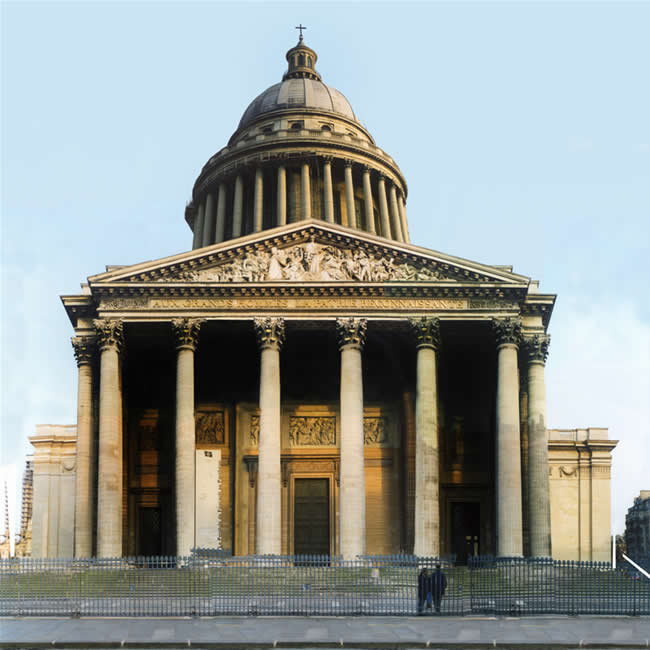
The Pantheon, Paris photo: Malcolm Aslett

Though this appears straightforward there was a lot of distortion of the parts to make the pillars vertical and to give the whole a symmetry. This might look better in black and white.

The Pantheon, Paris photo: Malcolm Aslett

Though this appears straightforward there was a lot of distortion of the parts to make the pillars vertical and to give the whole a symmetry. This might look better in black and white.