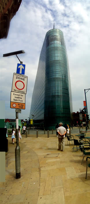
Pedestrian Zone, Manchester
photo: Malcolm Aslett
In city scenes like this you find the buildings to left and right creeping into the top of the photo at steep angles. As it tends to block the view into the middle I usually leave them. A slight darkening at the side of objects (such as the darker blue of the sky under the street light) indicates where joins were not fully worked to an edge. Here I left it as that ghostly effect gives a touch more visual interest.


