August 2017 - THIS week's PICTURE
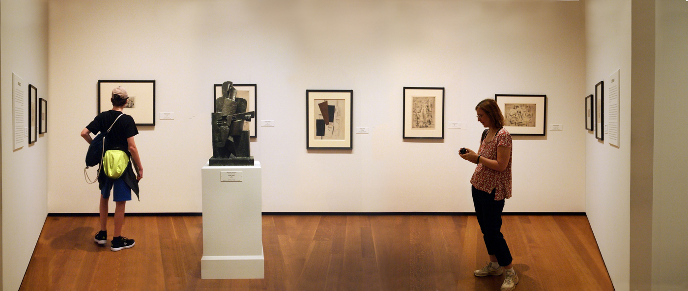
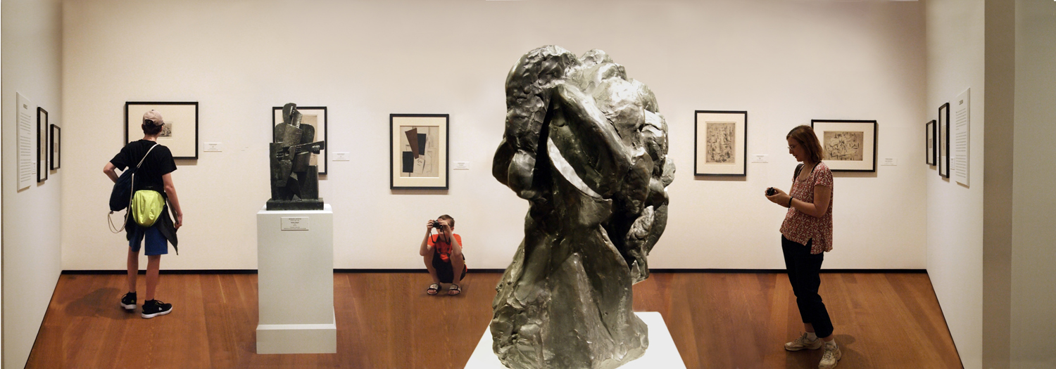
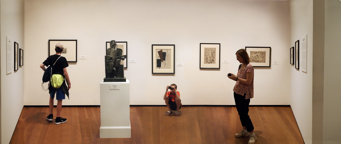
Smithsonian Cubist Gallery, DC: 4 takes, #4 photo by Malcolm Aslett
 |
A simple enough change in this image from the last version: muting the colour. The art objects become for the most part the black and white elements and the colour is retained in the human figures and the floor. Contextually I think this infers to the viewer the 'academic' nature of the objects as part of a historic tradition and the day to day other worldly players. It also plays up the shapes and design in preference to the colour. This appeases to a degree the busyness of the scene. I'm done with this for now. I also edited a version to only show the upper section without the floor. I'll stick it at the bottom of the page with all the other previous versions. Without the unique shape of the floor it loses the context of a 'joiner photograph' and could simply have been taken with a regular lens. Nothing wrong with it as a photograph but it loses a lot of meat from its bones. I have at least a half dozen more images from the same visit that play on different aspects of the gallery space. I'll bundle them together for next week. |
|
 |
 |


