November 2017 - THIS week's PICTURE
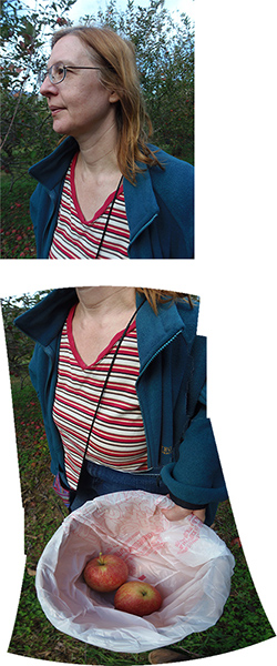
Picking Apples in Crozet VA: photo by Malcolm Aslett
|
|
Last week I showed an image that I had partially done with Photoshop CC photomerge software. This week I thought I would show what the software made of four photographs that I used to create the photo on the left.
The photos are taken sufficiently close to the subject that the face is parallel on the horizontal plane while the bucket with the two apples requires looking down to the ground, so a spread of almost ninety degrees. This has created an elongated effect on the torso, and, if you thought about it, the denied expectation of seeing legs at the bottom. The changing perspective means the legs have been lost in foreshortening behind the bucket.
The photomerge facility has several processes to choose from: Auto, perspective, cylindrical, spherical, collage and reposition. None of these would automatically provide the image on the left. In fact, some of the creations are frankly bizarre.
I'll begin by showing the four photographs below that were used for the test, followed by examples of what were created under the different settings. I get the impression that each choice has its own variables and that you could use the same settings and get different results. In this trial a couple of the settings gave very similar results.
The photos can also take some of the blame. They overlap considerably and that might have some effect. The red and white stripes of the top seem to cause confusion, as well as, for example, the varying sizes and placement of the purple pouch relative to arm and bucket in the second, third and fourth photos of the series.
I will skip saying what each one is below. I am not looking to do a technical assessment here. Rather to give an example of shortcomings in this situation. Note the first and fifth which leave the head separate. What the?
|
|
|
|
|
|
|
|
|
| 
00
S |
