CONCEPT 2: April Dinner
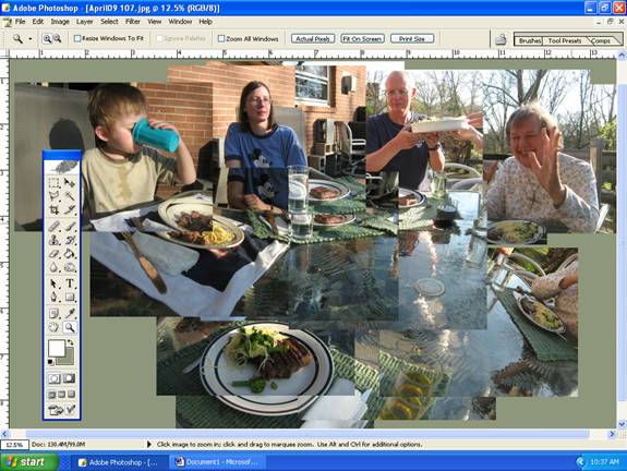
This joiner started with seventeen images. The following image is a screen shot of the initial arrangement.
Notice 4 things.
- Not all of the scene (the rectangle that will be the complete picture) has been photographed.
- Images overlap by a half and often more.
- More than one image has been taken of the people in the shot (3 or 4 in some cases).
- The images do not fit well as you move from the top to centre bottom (they can’t because while five images might go from left to right to do all the figures (say ten feet) the same number in the foreground might only cover the plate and the front of the table (perhaps three or four feet). The math does not add up. You have to distort things and make choices as to where to put them. A by-product of this is the varying in scale of forms (notice that Tom has a head more than twice as big as his Mum next to him).

One of the most important things to know is not evident in either picture: I did not know when I started what the final picture was going to look like. I made my decisions as I was going along according to what seemed best and appropriate. So the filled in areas at left and right were a simple solution that gave the image a wholeness. I like that the photographer’s plate is isolated and acts as a centre to all of the other items that seem to radiate from it. This involved a lot of photo-painting, something I enjoy doing.
