
10 POINTS ON JOINERS
Using David Hockney’s My Mother, Bolton Abbey (1982)
Multi-viewpoints from a single point in space.
This is the most obvious and common joiner. You stand in one place and take photos all around you. With a ‘panorama’ you simply swivel and take from left to right or vice versa. To record a greater field of vision you work both up and down and across.
Consider this rather intimate one by Hockney of his mother out visiting a ruined abbey on a rainy day:
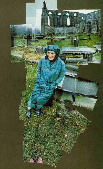
Study it a little. At head height is the abbey. Just below that is the line of his mother’s head as she rests on a grave. It swings down to his feet – A shade more than 90° top to bottom. He probably shot off two rolls of film (between 70 and 80 photos) and stopped when he finished the second roll.
Point 1. Getting it all. Around her head there is a bit of confusion – her head and the gravestones would be focused differently as well as having issues of parallax (the relationship of things at varying distances to the observer are out of whack to each other as you move your camera from one point to the next, if that makes sense). So he had to chose between items in focus and out of focus as well as which fitted best for continuity’s sake. The small (brown) gap is when you haven’t overlapped enough to get the whole of your field of vision – this is always complicated by ill fitting parts/ figures moving /a poor photograph/parallax/inattention/re-arranging parts and a dozen more things.
Point 2. Foreground and Background. There is always an oddity in the way the far away items pan compared to the things close up. You think you are covering the same area but when you put them together the foreground (the area closest) is always at a different scale to the background. Things CAN NEVER FIT PROPERLY. Taking photos of things far away and then close up we lose our sense of how things fit, how they relate to one another. Seriously, do it yourself and find out. You cannot imagine the result. Hence the fan shape and the conscious choice to leave a gap on the right (where the stone Mrs Hockney sits on has been ‘lowered’ considerably) to allow for her whole frame on the left to be shown consecutively and the stone be placed in relation to her rather than the tomb above it.
Point 3. The lens. I feel I ought to say that this is not taken with a wide angle lens. Most handy digital cameras nowadays have a default setting that is different from the old 50mm standard of SLR cameras (which is approximately what the eye sees normally). One of the reasons there are so many photographs here is because the field of vision of the camera lens isn’t so great. It may even be taken with a slight ‘magnification’ which you can do with an adjustable lens (a 28-80mm lens for example, that goes from a wide angle to, well, a telephoto.)
Point 5. Variations in exposure in sky. The obvious variation is in the upper section. If you take a photo of something with a little bit of sky and lots of buildings or land this usually means a light sky with little detail. More sky in the picture means an adjustment in exposure and more detail (i.e. darker) in the sky. As the pictures move up the sky gets darker. This is further compounded if you are rotating left and right, particularly on a sunny day. You might not notice it with the naked eye which has an iris that automatically adjusts the light for us, but the colour of the sky varies at every point, particularly say when looking near the sun and the opposite direction to the sun. In separate photos they vary in both tone and colour. Also, due to the way the light goes through a lens and onto a photograph, there can be variations at the edges of a photo caused ‘mechanically’. This is more obvious the wider angle the lens.
Point 6. Exposure and framing. We can see how the exposure changes in the colour of the raincoat as well as the tombstone. Photographing parts of one thing light and one thing dark always lead to a lack of detail somewhere. Best your individual photos include just up to the edge of an item but do both sides separately – e.g. do the dark item with only a little of the light item showing, then do the same for the light item so you get a decent exposure on both. If you are fitting together as Hockney does here it gives you a choice of images. If you are digitally marrying them it will give you a clean edge to work to on one side or the other.
Point 7. You never take enough photos. Hence the gaps. Hockney most likely got home and put these together and wished he had more photos to work with. There are usually gaps and dud photos. It used to be more an issue when using rolls of film. I would be very careful and spare with the photos I took. With digital cameras came the opportunity to take hundreds at a time. No need to skimp (but you probably will anyway.). Yes, too many can be very confusing. But remember it is usually impossible to go back and take the extra photos if you change your mind.
Point 8. Proportion and perspective. If you had taken this yourself you might have imagined the mum’s head to be bigger when you put it together. That’s because we think in human terms in these things. No. The grass somehow becomes a big deal and you were only taking it to get to your feet. And her feet seem so small and distant as perspective suddenly swoops away from you. Joiners are an exercise in learning how the eye and the brain ‘really’ see the world. Emphasis changes. Our newly discovered field of vision dwarfs our personal priorities of the scene, pushes people away, and makes a big deal of the spaces in between.
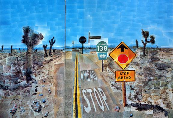
Point 9. The Whole Scene? You can’t get the ‘whole’ scene. You have to stop somewhere, you have to select some things and leave others out. But where do you stop? Where is the best place to have an edge? There is no easy answer. Not for this scene at least which clearly leaves things undiscovered. Could he have included the edge of the top left grave? Or the right hand portion of the tombstone his mum sits on? Add to that the fact if you take photos you often feel obliged to include them rather than edit them out for the sake of a better composition and…what is the solution. Well, there is one that can work. Fill out to as far as you can go and make a square or rectangle of them. As in this more famous one by Hockney of Pear Blossom Highway shown below. Otherwise, it is the nature of the joiner to appear selective, incomplete.
Point 10. Meaning and Narrative. By Hockney standards My Mother, Bolton Abbey is pretty ordinary, taken on the fly. However there is enough to build a narrative of interest. He views the ruins of the abbey they are visiting, his mother’s thoughtful face on a dreary day sitting on a tombstone to reveal interpretations of mortality etc., and then ‘signs’ the photo with his own feet. It is a personal record and a very touching one. A loving son with his elderly mum worrying about the time he won’t have her. OR: it is an observation of an elderly person thinking of things that have passed. OR...but you get the idea. Some subjects are better at carrying certain meanings than others. Joiner photos can re-emphasize that personal element however that makes the normal photograph's handling appear glossy and slick in comparison. A memento mori rarely fails.
![]()
![]()