
10 POINTS ON JOINERS
Differing Viewpoints in a Joiner Photograph
Example using David Hockney’s The Desk, (July 1st 1984)
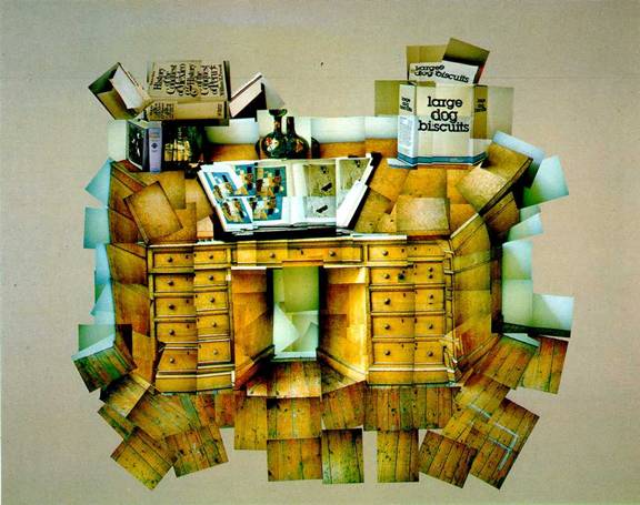
Hockney is a great admirer of Picasso and Cubism (though honestly, this is more reminiscent of Juan Gris’ paintings to me due to the literal nature of the cubist borrowings). He seems to be thoroughly enjoying himself, making the desk and objects do what they are not supposed to do – showing top and both sides at the same time.
- Colour and Tone. If you or I did it we would probably run into problems with the lighting of the object. How are the tones so consistent on top, at front and to left and right, even under the top? I don’t know. But it would be an issue with a desk in a normally lit office. Maybe it is in his studio with skylights. Whatever the case this even light quality helps give the photos a pleasing, mellow homogeneity. I suspect if it had been otherwise the variations would have been distracting and more difficult to deal with. We get just a hint of it on certain edges that actually enhance the shape, giving it a sketched and drawn character.
- Thinking about what you are doing. Right from the start Hockney has decided to ‘do the opposite’ of what our intelligent eye expects. The perspective of the book is reversed, the box of ‘Large Dog Biscuits’ shows both sides equally as well as the top; so too does the desk itself with the top ‘tipped up’ and some of the floorboards seen from directly above.
- To achieve this all he must have had a reasonable idea of what he wanted it to look like in the end. He has photographed the front sequentially and parallel to the face from quite close up – he has to be an equal distance from the face at all times for the photos to fit properly. That the drawers aren't evenly lined up show he wasn't as precise as he could have been and suggests he didn't care to have them fit exactly. Then he has adopted a specific angle to shoot at for the top and each of the four side panels. He also needs more photos of the back of the desk and its objects to ensure he has enough to cover the area he has enlarged to a counter-intuitive isosceles trapezoid. Well, there is the quality of his higher aesthetic and organizational brain. Tipping up the books and box tops so we can read them easily. It’s what we want to do in photos but aren’t allowed to do. It is a treat for us. This also harks back to his early Typhoo Tea painting done as a student so he is also being true to his roots.
THE MAJOR PROBLEM with the IDEA and the EXECUTION of a JOINER
Using the example of David Hockney’s DAVID GRAVES
It is simply this: You have an idea, you take the photos, you put it together and….
Usually you don’t get to see what works and what fits where until you are doing it. Then it is often too late to correct all of the issues arising concerning the photos.
Is there a way around it? Not so much.
In the series Hockney did with Polaroids he did have one major advantage. Look at this one:
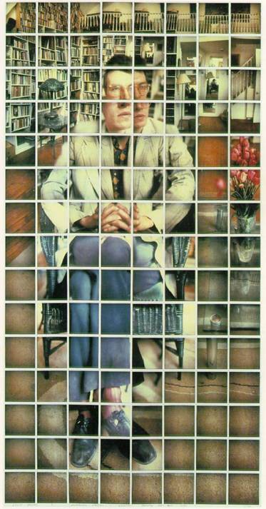
This doesn’t look easy, but still, it isn’t as easy as it looks. I would guess that he had to take a lot more photos than are shown here. The trick would be to start constructing your joiner as you go and retake images that aren’t sufficiently consecutive. It’s a big balancing act and it makes me wonder about single photos and the decisions behind them.
Though he organizes the forms as he would the elements of a painting or drawing the parts would not have naturally occurred in a photographic sequence. We get the vase to right, the backwall spread of bookcases and banisters, the hands and shoes that are so importantly composed, the spread of carpet that attempts to be as blank as possible and the all important face split into four (four eyes? Is it partly a pun or the quickest simplest solution or did he try a dozen before he was satisfied on this arrangement?). Just a guess again but I suspect he may have tried a single photo for most of the head, then found it didn't compose well with the other parts, that it appeared too small and unemphatic (a true to size head centred in a polaroid would also over-determine the frames around it. So he actually moved closer and increased the head size so it takes up more space and the enlarged head is more pleasingly situated within the composition of the overall rectangle. Or am I over thinking it? Whatever the case I think aspects would nag a consummate portraitist like him - if this were a drawing wouldn't he be engrossed with details like the nose and lips and a certain line of chin or brow? Did the division of parts remind him of Picasso portraits and lead him away from traditional portraiture again?
The Grid: a big help to providing cohesion.
The Technique: Polaroids? They don’t last forever. I have considered doing something similar with a digital camera hooked up to the computer to enable a ‘real time’ construction. It would be an excellent way of experimenting with forms.
![]()
![]()